Actions
Actions are the individual steps an Interaction performs on a visitor's page. In Automatic targeting mode, every journey has its own action list, and so does the Everyone else card. In Manual embed mode the Interaction has a single action list. Wherever they live, actions are built and edited the same way.
Action Types
| Type | What it does |
|---|---|
| Template | Renders a published Template into the page |
| Component | Shows a ready-made login form, signup form, gate, and more |
| Run JavaScript | Executes your own script on the page |
| Apply CSS | Injects styles into the page |
| Cookie | Sets a cookie on the visitor |
| Frequency cap | Limits how often the actions inside it run |
Frequency cap is available in Automatic targeting mode only, because the count happens when a journey matches.
The Action List
Click Add action and choose a type. The new action opens in the action editor right away; canceling the editor at that point removes the action again.
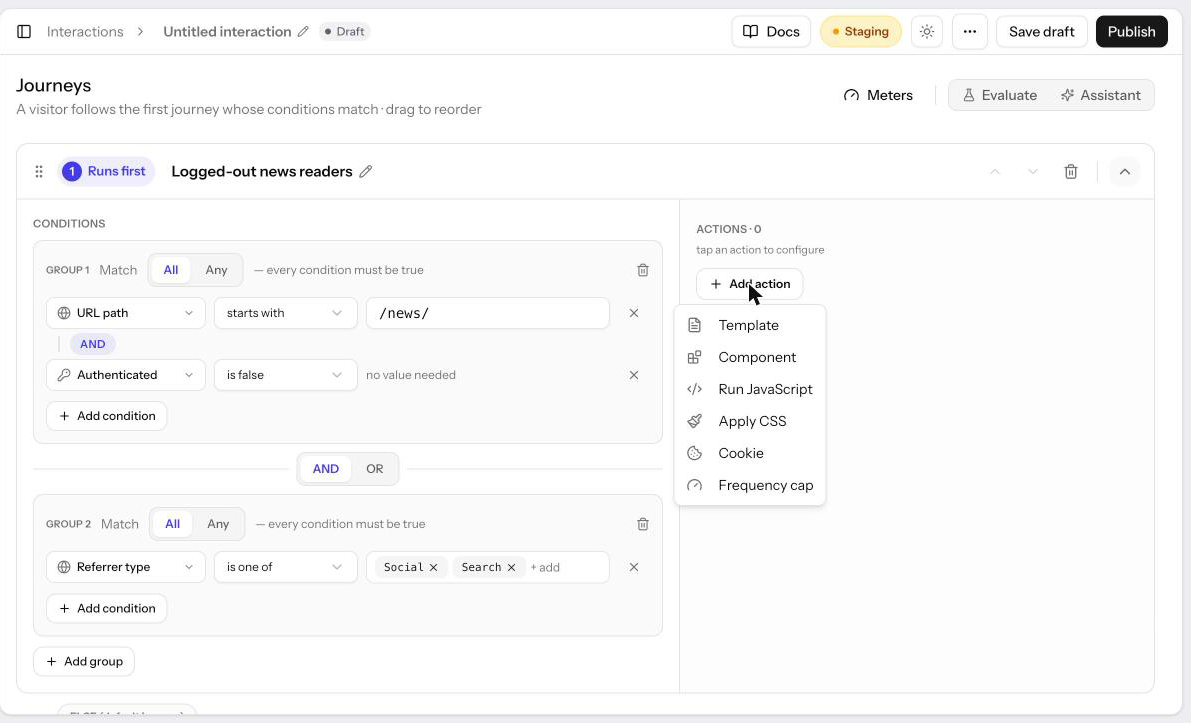
Actions run in list order, top to bottom. Drag a row to reorder, or use the arrow buttons. In Automatic targeting mode you can also drag a row into another journey's action list, or into Everyone else, to move it there. Click a row to open it in the editor. A row shows a Needs attention chip when the action has a validation error.
The Action Editor
Every action opens in the same editor dialog. The header shows the action's name
(click it to rename; names are up to 80 characters and appear in the action list
and in revision history) and where the action lives, such as
VIP readers · Action 1 of 2 or Everyone else · Action 1 of 1.
Below the header, a type switcher lets you change the action's type: Render template, Show component, Run JS on page, Apply CSS, or Set cookie. Switching away from a type and back restores what you had entered.
The body has up to three sections:
| Section | Purpose | Shown for |
|---|---|---|
| What it does | The template, component, code, or cookie to apply | All types |
| Where it applies | The part of the page the action targets | Template and Component (JS and CSS show a fixed "whole page" card) |
| When it runs | The delay before the action executes | All types |
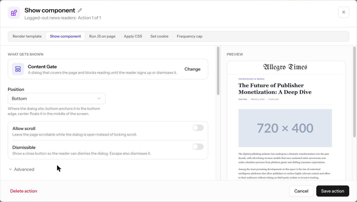
Template and Component actions also get a live placement preview beside the sections, with a one-line recap such as "Added immediately before the area." Component actions also show a live render of the component on a sample article, which updates as you change its settings.
Changes are held as a draft until you click Save action. Cancel, Esc, or clicking outside the dialog discards the draft. Delete action removes the action from its list.
What It Does
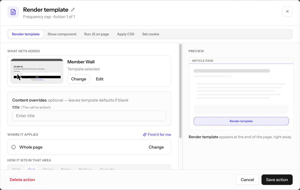
Template
Click Select (or Change) to pick a published Template. If the Template defines fields, a Fields summary lists them by tab, and Edit Fields (or a tab's row) opens a drawer to fill in the values this action uses. Each field starts with the Template's default, and edits apply as you type; click Done to return, then save the action. Fields you don't edit keep following the Template's defaults.
Component
A Component action shows one of Allegro's ready-made components, with no Template to build first. Choose a component from the picker:
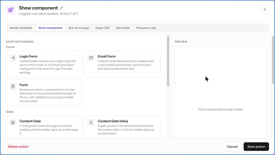
| Group | Component | What it shows |
|---|---|---|
| Forms | Login Form | Signs readers in with an emailed link or code, or a social login |
| Forms | Email Form | Collects an email address, with an optional disclaimer |
| Forms | Form | One of your Forms, for signed-in members to fill out |
| Gates | Content Gate | A dialog over the page that blocks reading until the reader signs up |
| Gates | Content Gate Inline | A gate in the article that hides the rest of it until the reader signs up |
| Content | Recommendations | A "Read next" list of articles picked for the reader |
Once you choose one, its settings appear below it: text such as button labels and headings, choices such as the login method, and on/off switches. Each setting explains what it controls, and an empty field uses the component's own default. Settings for developers, such as tracking data, are under Advanced. Click Change to choose a different component; settings the two components share are kept.
Inside the gate
The two gates show something inside them. Under Inside the gate, enter an optional Heading and Message, then pick the form readers fill in to get past the gate. Login Form and Email Form are offered first; choose Another component… for any other. Click Customize to change the inner form's own settings.
A Content Gate with a Login Form inside makes a registration wall in a few clicks: set its heading to "Keep reading for free", turn off Dismissible, and truncate the article behind it.
Run JavaScript
Write any valid JavaScript in the code editor. The code runs in the context of the page when the action executes. Use this for analytics events, third-party integrations, or custom behavior that doesn't fit a Template. Click Format to tidy the code.
JavaScript actions run in your visitors' browsers. Only use trusted code here.
Apply CSS
Write standard CSS in the code editor. The styles apply globally to the page when the action executes. Because templates render inside a shadow root, their own CSS stays inside the template; use a CSS action to hide elements, adjust layout, or apply theme overrides on the page itself.
Cookie
| Setting | Description |
|---|---|
| Set readable cookie | On by default for new cookie actions. A readable cookie's name gets an _al_ prefix (promo_seen is stored as _al_promo_seen), which lets journeys target it with a Cookie condition. Turn it off to set a cookie with exactly the name you enter; Allegro can't read that cookie back. |
| Name | The cookie name (for example promo_seen). With Set readable cookie on, the _al_ prefix is shown in front of the field and added for you; the name may use only letters, numbers, dashes, and underscores. |
| Value | The value to store (for example 1) |
| Keep for | This visit (a session cookie that clears when the browser closes), 7 days, 30 days, A year, or Custom… for any number of days from 1 to 365. New cookie actions default to 30 days. |
| Path | The URL path the cookie applies to. Defaults to / (the entire site). |
| Domain (optional) | Restrict the cookie to a specific domain (for example .acme.com). Leave empty to use the current domain. |
Frequency cap
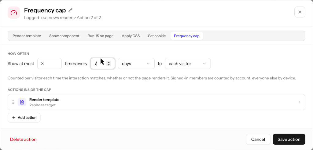
A frequency cap wraps other actions and delivers them at most a set number of times in a sliding window — for example, a promo banner at most three times every 24 hours, or a launch announcement once per visitor every 30 days.
| Setting | Description |
|---|---|
| Show at most | How many times the actions inside may run within the window (1 to 1000) |
| Every | The length of the window, in minutes, hours, or days, up to 365 days in total. The window slides: an impression stops counting once it is older than the window. |
| To | each visitor counts every visitor separately — signed-in members by account, everyone else by device. everyone keeps one shared count across all visitors, for something that should only happen a limited number of times in total. |
Below the settings, Actions inside the cap lists the actions the cap limits. Add Template, Component, Run JavaScript, Apply CSS, and Cookie actions there (a cap cannot contain another cap); each opens in its own editor on top of the cap's. Those actions keep their own placement and timing. The cap itself has none: it is counted the moment the Interaction matches on a page view, whether or not the page goes on to render the actions.
Changing the limit, the window, or who it applies to starts the count over. Renaming the cap or editing the actions inside it does not. If the visitor cannot be identified, or the counter is unavailable, the actions run as if there were no cap.
Where It Applies
This section is for Template and Component actions. JavaScript and CSS actions always run against the whole page, and cookie actions have no placement. A Content Gate opens over the page wherever the reader is, so it shows a fixed Covers the page card instead.
Truncating the Article Behind a Gate
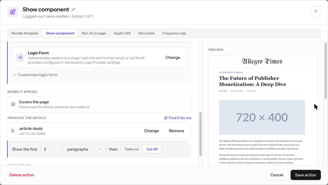
Below the Covers the page card, a Content Gate offers Truncate the article, which cuts the story short behind the gate. Click Pick an area and choose the article body (type a selector, pick a saved area, or use Find it for me). Then set Show the first N paragraphs or words, then either Fade out or Cut off. Remove keeps the whole article on the page again.
Choosing an Area
The area card shows where the template or component goes. New actions start on Whole page, which appends the template to the end of the page body. Click Change to pick a different area:
- Whole page — append to the end of the body.
- A saved area — an area found earlier with Find it for me, shown by its friendly name.
- A CSS selector — type one yourself, such as
.article-bodyor#sidebar.
How It Sits in That Area
Once an area is selected, choose how the template or component is inserted relative to it. Truncate is available for Template actions only.
| Option | Behavior |
|---|---|
| Start | Added as the first thing inside the area |
| End | Added as the last thing inside the area |
| Above | Added immediately before the area |
| Below | Added immediately after the area |
| Replace | Replaces the area's content entirely |
| Truncate | Limits how much of the area is shown |
Choosing Truncate reveals one more row: Show the first N paragraphs or words, then either Fade out (the template overlays the remaining content behind a fade) or Cut off (the remaining content is removed). New truncate actions start at 3 paragraphs, cut off.
Use Truncate with Fade out to create a content-paywall effect: show the first few paragraphs, then overlay a subscription prompt.
Find It for Me
If you don't know the right CSS selector, let Allegro find it on a real page.
- Click Find it for me in the Where it applies section.
- Enter an Example page URL from your site (it must start with
https://) and describe What are you targeting?, for example "the article body, under the headline". - Click Find matches. Allegro reads the page and suggests up to six areas. Each suggestion shows a friendly name, the selector it resolved to, and how many elements on that page it matched.
- Pick one to use it as the action's area, or type a selector manually below the results.
Areas found this way are saved for your organization (the 50 most recent), so future actions can select them by name without another scan.
When It Runs
Every action except a frequency cap has a timing setting. The delay is measured from the moment the Interaction fires on the page.
| Option | Behavior | Available for |
|---|---|---|
| Right away | Runs as soon as the Interaction fires | All actions |
| After a few seconds | Waits the number of seconds you enter (default 3) | All actions |
| After scrolling a set distance | Waits until the visitor scrolls the distance you enter, in pixels or percent of the page (default 500 pixels) | All actions |
| When it scrolls into view | Waits until the action's target area enters the viewport | Template and Component actions with a selected area |
| As the truncation point nears | Waits until the visitor scrolls to within the number of pixels you enter of the truncation point (default 200) | Template actions using Truncate, and Content Gates that truncate the article |
If you change the area or placement so that a timing option no longer applies, the action falls back to Right away.
Related
- Interactions — Trigger modes, lifecycle, and publishing
- Journeys — Deciding which visitors get which actions
- Templates — Building the content that Template actions render